Home > KH Group > CI
CI
CI story
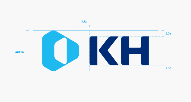
The symbol mark is a visual object that represents and symbolizes KH as a whole.
It symbolizes a large tree with branches spreading out in all directions from the center of KH's single tree, forming a forest.
The image is created by combining the pillars of a giant tree and the KH word, and the shape of leaves spreading in all directions symbolizes our unstoppable challenge to our employees around the world and new business areas.
The image of KH must be used in accordance with the regulations outlined in the guide so that it should be delivered correctly. And it cannot be used by arbitrarily damaged or altered in any case.
-
Light BluePantone 299 C
C75
R0 G175 B236 -
BluePantone 2145 C
C100 M70
R0 G78 B162 -
Deep BluePantone 280 C
C100 M80 Y0 K35
R0 G44 B118
Color System
The image of KH must be used in accordance with the regulations outlined in the guide so that it should be delivered correctly. And it cannot be used by arbitrarily damaged or altered in any case.
- KH Group News
- KH News
- IR
- KH Philosophy
- Social Contribution
- Bluenanum Foundation
- Lighting Museum
- Children Festival
- News
Family Site
Bottom area
© KH group. All Rights Reserved.